
(2016/10/14)改訂版があります。
はてなブログ/ボトムナビゲーション改訂版 – IMUZA.com
「はてなブログ=レスポンシブデザインの場合のスマホ UI を考えてみる – IMUZA.com」で記事にしたスマホ用ボトムナビゲーションは、オール Javascript で作り込んでいますが、いろいろやってみましたら、意外と簡単な方法が見つかりました。
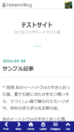
はてなブログの最新記事やカテゴリーは、デフォルトですとサイドバー、スマホの場合の多くは記事の後に表示しますが、これをボトムにfixedで固定してしまえば、ナビゲーションになります。ということで完成したものが下の画像です。
01仕様
- CSS を
@media (max-width: 480px)で切っていますので、使用テーマに合わせて変更してください。 - Latest、Category は、「最新記事」「カテゴリー」モジュールを必ずサイドバーに追加する必要があります。デスクトップでは通常の表示となり、スマホではアイコンをクリックすると表示するようになります。
- Top は、ページトップへスムーズスクロールします。
- Home は、トップページへ移動します。
- Prev、Next は、若干説明を要します。
- 新しくページが開かれた場合は、Prev はなし、Next は、該当ベージのページャーに次ページがあれば、それへのリンクです。
- サイト内で移動している場合の Prev は、常に前のページへ戻ります。
- Next は、常に該当ページのページャーの次へと同等です。
02導入方法
次のコードの4行目*****サイトURL*****を自分のサイトの URL に変更して、カスタマイズ > フッタ に入れてください。
<div id="nav-panel">
  <a href="javascript:void(0)" class="nav-prev nav-none" title="Prev"></a>
  <a href="javascript:void(0)" class="nav-next nav-none" title="Next"></a>
  <a href="*****サイトURL*****" class="nav-home" title="Home"></a>
  <a href="javascript:void(0)" class="nav-recent" title="Latest"></a>
  <a href="javascript:void(0)" class="nav-category" title="Category"></a>
  <a href="javascript:void(0)" class="nav-top" title="Top"></a>
</div>
<script>
  function togglePanel(a, b) {
    if (document.getElementsByClassName(b)[0].className.indexOf('visible') !== -1) document.getElementsByClassName(b)[0].classList.remove('visible');
    document.getElementsByClassName(a)[0].classList.toggle('visible');
  }
  function scrollToTop() {
    y = window.pageYOffset;
    setTimeout(function(){
      if (y >= 0){
        y = y - y / 10 - 1;
        window.scrollTo(0, y);
        setTimeout(arguments.callee, 10);
      }else{
        window.scrollTo(0, 0);
      }
    }, 10);
  }


  (function(){
    var checkRef = 0,
      nowLoc = window.location.href,
      thisHost = location.hostname,
      thisRef = document.referrer;
    if (thisRef.indexOf(thisHost) !== -1) checkRef = 1;
    if (thisRef === 'http://' + thisHost + '/') checkRef = 2;
    if (checkRef !== 0) {
      var prev = document.getElementsByClassName('nav-prev')[0];
      prev.classList.remove('nav-none');
      prev.addEventListener('click', function(){history.back()}, false);
    }
    if (checkRef === 0 && nowLoc === 'http://' + thisHost + '/') checkRef = 2;
    var pagerNext = document.getElementsByClassName('pager-next')[0];
    if (checkRef !== 0 && pagerNext !== undefined) {
      var next = document.getElementsByClassName('nav-next')[0];
      next.classList.remove('nav-none');
      next.setAttribute('href', pagerNext.getElementsByTagName('a')[0]);
    }
    document.getElementsByClassName('nav-recent')[0].addEventListener('click', function(){togglePanel('hatena-module-recent-entries', 'hatena-module-category')}, false);
    document.getElementsByClassName('nav-category')[0].addEventListener('click', function(){togglePanel('hatena-module-category', 'hatena-module-recent-entries')}, false);
    document.getElementsByClassName('nav-top')[0].addEventListener('click', scrollToTop, false);
  })();
</script>
カスタマイズ > デザインCSS に次のスタイルを追加してください。ナビゲーション、パネルの背景色はコメント部分のカラーコードを変更してください。
@media (max-width: 480px) {
  /* 最新記事、カテゴリー */
  .hatena-module-recent-entries,
  .hatena-module-category {
    position: fixed;
    bottom: 46px;
    background: #2528b7; /* バネルの背景色 */
    color: #ffffff;
    width: 100%;
    left: 0;
    margin-bottom: 0;
    max-height: 0;
    overflow: hidden;
    -webkit-transition: all .3s linear;
    transition: all .3s linear;
    font-size: 14px;
  }
  .hatena-module-recent-entries a,
  .hatena-module-category a {
    color: #ffffff;
  }
  .hatena-module-recent-entries .hatena-urllist li,
  .hatena-module-category .hatena-urllist li {
    padding: 0;
    border-bottom: 1px solid rgba(255, 255, 255, 0.5);
    overflow: hidden;
  }
  .hatena-module-recent-entries .hatena-urllist li a,
  .hatena-module-category .hatena-urllist li a {
    display: block;
    padding: 0;
    border: none;
    font-size: inherit;
    padding: 5px 10px;
    height: 42px;
    overflow: hidden;
  }
  .hatena-module-recent-entries .hatena-urllist li a:hover,
  .hatena-module-category .hatena-urllist li a:hover {
    color: rgba(255, 255, 255, 0.5);
  }
  .hatena-module-recent-entries .recent-entries-date-link,
  .hatena-module-recent-entries .recent-entries-categories,
  .hatena-module-recent-entries .recent-entries-entry-body {
    display: none;
  }
  .hatena-module-recent-entries .hatena-urllist li a.recent-entries-image-link,
  .hatena-module-recent-entries .hatena-urllist li a.bookmark-widget-counter {
    display: none;
  }
  .hatena-module-recent-entries .hatena-module-title {
    margin: 0;
    padding: 0;
    border: none;
    font-size: inherit;
    font-weight: normal;
    border-bottom: 1px solid rgba(255, 255, 255, 0.5);
  }
  .hatena-module-recent-entries .hatena-module-title a {
    display: block;
    line-height: 42px;
    padding: 5px 10px;
    height: 42px;
    font-weight: bold;
  }
  .hatena-module-recent-entries .hatena-module-title a::after {
    content: "すべての記事一覧";
    position: absolute;
    left: 0;
    width: 100%;
    background: #2528b7; /* バネルの背景色を変更したら同色に */
    padding-left: 10px;
    padding-right: 10px;
  }
  .hatena-module-category .hatena-module-title {
    display: none;
  }
  .hatena-module-category .hatena-urllist li a {
    height: inherit;
  }
  .visible.hatena-module-recent-entries {
    max-height: 320px;
  }
  .visible.hatena-module-category {
    max-height: 360px;
  }
  /* ナビゲーション */
  #nav-panel {
    height: 46px;
    position: fixed;
    bottom: 0;
    left: 0;
    width: 100%;
    background: #1c1f8c; /* ナビゲーションの背景色 */
    display: -webkit-flex;
    display: flex;
    -webkit-flex-direction: row;
    flex-direction: row;
  }
  #nav-panel a {
    text-align: center;
    width: 20%;
    display: block;
    color: #ffffff;
    font-size: 21px;
    text-decoration: none;
  }
  #nav-panel a:active {
    color: rgba(255, 255, 255, 0.5);
  }
  #nav-panel a.nav-none {
    color: rgba(255, 255, 255, 0.3);
  }
  #nav-panel a::after {
    content: attr(title);
    display: block;
    font-size: 11.2px;
  }
  #nav-panel a.nav-prev::before {
    font-family: blogicon;
    content: "\f005";
  }
  #nav-panel a.nav-next::before {
    font-family: blogicon;
    content: "\f006";
  }
  #nav-panel a.nav-home::before {
    font-family: blogicon;
    content: "\f017";
  }
  #nav-panel a.nav-top::before {
    font-family: blogicon;
    content: "\f007";
  }
  #nav-panel a.nav-recent::before {
    font-family: blogicon;
    content: "\f031";
  }
  #nav-panel a.nav-category::before {
    font-family: blogicon;
    content: "\f039";
  }
  #footer {
    margin-bottom: 46px;
  }
}
以上で、スマホの場合には、画像のようなナビゲーションが表示されます。
急ぎ(風呂に入るので 笑)アップしましたのでチェックが不完全かもしれません。問題があればコメントでお願いします。また、もう少しカスタマイズの説明を別記事にする予定です。
また、テーマに公式の evergreen を使っており、他のテーマですと CSS の微調整が必要と思われます。ご質問があればコメントでお願いします。