
はてなブログテーマ開発(番外)グリッドレイアウトを使ってみる
記事ページの基本構造がほぼ出来ましたので、トップページに移り、ブログタイトルなど共通部分がこのままでいけるかどうか確認します。
トップページのレイアウトは、1カラムでグリッドレイアウトにしようと思います。
はてなブログテーマ開発(1)
はてなブログテーマ開発(2)
はてなブログテーマ開発(3)
はてなブログテーマ開発(4)
はてなブログテーマ開発(5)
はてなブログテーマ開発(6)(Javascript 記載の漏れがありました)
はてなブログテーマ開発(7)
01autoprefixer が grid に対応していない
とりあえずの構想を Developer Tools で作ってみました。

なんだか背景画像がもうひとつですが、まあとりあえずということで…(笑)。
で、記事の一覧表示に display:grid; を使ってみたのですが、Hatena-Blog-Theme-Boilerplate の autoprefixer が grid には対応していないようです。README.md には、デフォルトでは false になっているので、
autoprefixer({ grid: true });
にするようにとはあるのですが、postcss.config.js を作ったり、package.json の autoprefixer に直接オプションをつけてみたりしたのですが、どうしてもアクティブになりません。
あきらめました。それに、このケースはむしろ flex のほうが適しているようにも思います。
ちなみに、上の画像の scss は次のようになっています。
.page-index.page-archive {
    #content-inner {
        @media #{$mq-bp} {
            flex-direction: column;
        }
    }
    #wrapper {
        @media #{$mq-bp} {
            max-width: 100%;
            width: 100%;
        }
    }
    .archive-entries {
        display: grid;
        grid-gap: 30px;
        grid-template-columns: repeat(auto-fill, minmax(294px, 1fr));
        @media (max-width: 319px) {
            grid-template-columns: repeat(auto-fill, minmax(var(--content-width), 1fr));
        }
    }
}
02SASSコンパイル環境を作ってみる
あきらめはしたものの気になって仕方ありませんので、じゃあ自分で grid に対応した autoprefixer の SASSコンパイル環境を作ってみようということになりました。ということで番外編です。
Windows10 でやっています。
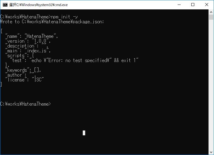
適当なフォルダを作り、> npm init -y で初期化し、package.json を作ります。
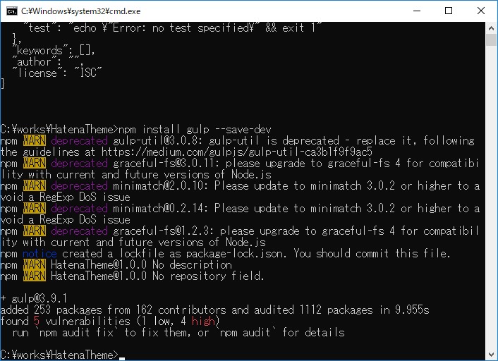
npm-scripts でもいいのですが、タスクランナーの gulp を使ってみます。
5つの脆弱性があるので、> npm audit fix を実行しなさいとあります。npm audit は npm@6 から導入されたものらしいです。指示通りに進んでみます。
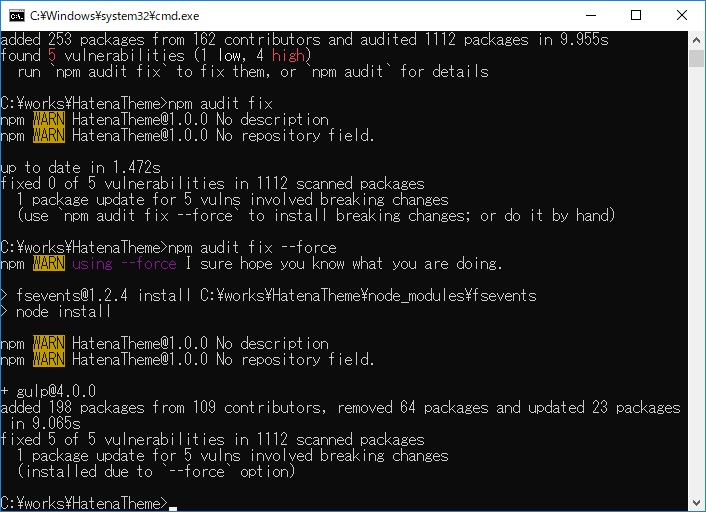
さらに、> npm audit fix --force にしなさいと言われています。完了したようです。
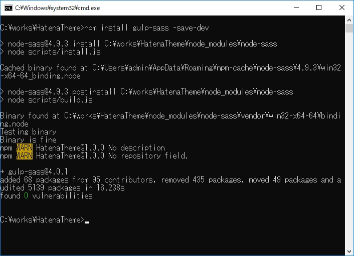
gulp-sass を入れます。gulp-sass というのは、node-sass を使っているんですかね。今のところちょっと不明。
var gulp = require('gulp');
var sass = require('gulp-sass');

gulp.task('default', function () {
  return gulp.src('css/style.scss')
    .pipe(sass({
      outputStyle: 'expanded',
//      indentType: 'tab',
      indentWidth: 4
        }))
    .pipe(gulp.dest('css'));
});
チェック用の gulpfile.js をプロジェクトフォルダに作り、> npx gulp としますと実行されます。
画像はありませんが、続いて > npm install gulp-autoprefixer --save-dev として autoprefixer をインストールし、gulpfile.js に下のように追加します。
var gulp = require('gulp');
var sass = require('gulp-sass');
var autoprefixer = require('gulp-autoprefixer');

gulp.task('default', function () {
  return gulp.src('css/style.scss')
    .pipe(sass({
      outputStyle: 'expanded',
      indentWidth: 4
    }))
    .pipe(autoprefixer({
      browsers: ["last 2 versions"],
      grid: true
    }))
    .pipe(gulp.dest('css'));
});
autoprefixer の対象ブラウザは、チェック用ですのでとりあえず browsers: ["last 2 versions"] としています。新しいことをやりますと、調べることがどんどん増えます。
$break-point: 768px;
$mq-bp: "(min-width: " + $break-point + ")";


#content-inner,
#blog-title-content {
    display: flex;
}


#blog-title-content {
    justify-content: space-between;
    align-items: center;
}


#content-inner {
  flex-direction: column;
  justify-content: space-between;
    @media #{$mq-bp} {
        flex-direction: row;
    }
}


.page-index.page-archive {
    .archive-entries {
        display: grid;
        grid-gap: 30px;
        grid-template-columns: repeat(auto-fill, minmax(294px, 1fr));
    }
}
_core.scss から取り出したコードをコンパイルしてみます。
#content-inner,
#blog-title-content {
    display: -webkit-box;
    display: -ms-flexbox;
    display: flex;
}


#blog-title-content {
    -webkit-box-pack: justify;
        -ms-flex-pack: justify;
            justify-content: space-between;
    -webkit-box-align: center;
        -ms-flex-align: center;
            align-items: center;
}


#content-inner {
    -webkit-box-orient: vertical;
    -webkit-box-direction: normal;
        -ms-flex-direction: column;
            flex-direction: column;
    -webkit-box-pack: justify;
        -ms-flex-pack: justify;
            justify-content: space-between;
}


@media (min-width: 768px) {
    #content-inner {
        -webkit-box-orient: horizontal;
        -webkit-box-direction: normal;
            -ms-flex-direction: row;
                flex-direction: row;
    }
}


.page-index.page-archive .archive-entries {
    display: -ms-grid;
    display: grid;
    grid-gap: 30px;
    grid-template-columns: repeat(auto-fill, minmax(294px, 1fr));
}
grid 以外はうまくいっているようです。display: -ms-grid; が追加されていますのでアクティブにはなっているようですが、下のエラーが出ています。
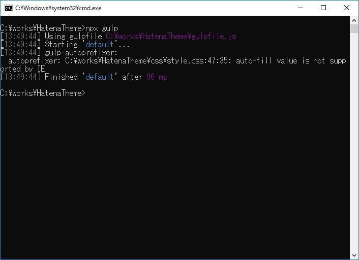
auto-fill が IE に対応していないと出ています。対応していないから、autoprefixer を使っているんですが、どういうことでしょう?
grid 自体もまだ完全には理解していませんし、autoprefixer も深入りしたのは初めてですし、やらなくてはいけないことが増えるばかりです(笑)。
今回はここまでです。長くなりそうです…。